如果这篇博客能够帮助到你,点个赞再走吧~
CC BY 4.0 (除特别声明或转载文章外)
[toc]
过渡与动画
1、过渡
过渡(transition)
- 通过过渡可以指定一个属性发生变化时的切换方式
- 通过过渡可以创建一些非常好的效果,提升用户的体验
属性值
transition-property:指定要执行过渡的属性
- 多个属性间使用
,隔开; - 如果所有属性都需要过渡,则使用
all关键字; - 大部分属性都支持过渡效果;
- 注意过渡时必须是从一个有效数值向另外一个有效数值进行过渡;
transition-duration:指定过渡效果的持续时间
- 时间单位:s 和 ms(1s=1000ms)
transition-delay:过渡效果的延迟,等待一段时间后在执行过渡
transition-timing-function:过渡的时序函数
linear匀速运动ease默认值,慢速开始,先加速后减速ease-in加速运动ease-out减速运动ease-in-out先加速后减速cubic-bezier()来指定时序函数 https://cubic-bezier.comsteps()分步执行过渡效果,可以设置第二个值:end,在时间结束时执行过渡(默认值)start,在时间开始时执行过渡
transition:可以同时设置过渡相关的所有属性
- 只有一个要求,如果要写延迟,则两个时间中第一个是持续时间,第二个是延迟时间
示例
/* transition: margin-left 2s 1s; */
transition-property: margin-left;
transition-duration: 2s;
transition-delay: 1s;

几种过渡效果对比
linear匀速运动
transition-timing-function: linear;
ease 默认值,慢速开始,先加速后减速
transition-timing-function: ease;

ease-in 加速运动
transition-timing-function: ease-in;

ease-out 减速运动
transition-timing-function: ease-out;

ease-in-out 先加速后减速
transition-timing-function: ease-in-out;

cubic-bezier()来指定时序函数
transition-timing-function: cubic-bezier(0.17, 1.79, 0.68, -0.69);
steps()分步执行过渡效果
/* transition-timing-function: steps(2, end); */
transition-timing-function: steps(2);

transition-timing-function: steps(2, start);

2、动画
动画和过渡类似,都是可以实现一些动态的效果,不同的是
- 过渡需要在某个属性发生变化时才会触发
- 动画可以自动触发动态效果
设置动画效果,必须先要设置一个关键帧,关键帧设置了动画执行每一个步骤
@keyframes test {
  from {
    margin-left: 0;
  }

  to {
    margin-left: 900px;
  }
}
animation-name 指定动画的关键帧名称
animation-duration:指定动画效果的持续时间
animation-delay:动画效果的延迟,等待一段时间后在执行动画
animation-timing-function:动画的时序函数
animation-iteration-count 动画执行的次数
infinite无限执行
animation-direction 指定动画运行的方向
normal从from向to运行,每次都是这样,默认值reverse从to向from运行,每次都是这样alternate从from向to运行,重复执行动画时反向执行alternate-reverse从to向from运行,重复执行动画时反向执行
animation-play-state 设置动画的执行状态
running动画执行,默认值paused动画暂停
animation-fill-mode 动画的填充模式
none动画执行完毕,元素回到原来位置,默认值forwards动画执行完毕,元素会停止在动画结束的位置backwards动画延时等待时,元素就会处于开始位置both结合了forwards和backwards
示例
/* animation-name: test;
animation-duration: 2s;
animation-delay: 2s;
animation-timing-function: linear;
animation-iteration-count: infinite;
animation-direction: alternate;
animation-fill-mode: both; */

animation: test 2s 2s linear infinite alternate both;
3、实战
米兔
.box {
  height: 271px;
  width: 132px;
  background-image: url("/assets/米兔/bigtap-mitu-queue-big.png");
  margin: 100px auto;
  transition: background-position 1s steps(4);
}

.box:hover {
  background-position: -528px 0;
}

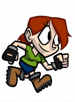
奔跑的少年
.box {
  height: 256px;
  width: calc(1536px / 6);
  background-image: url("/assets/奔跑的少年/bg2.png");
  margin: 100px auto;
  animation: run 1s steps(6) infinite;
}

/* 关键帧 */
@keyframes run {
  from {
    background-position: 0 0;
  }

  to {
    background-position: -1536px 0;
  }
}
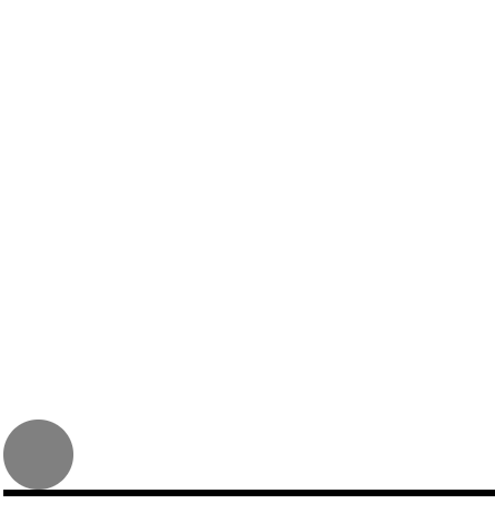
弹力球
.outer {
  width: 100%;
  height: 700px;
  border-bottom: 10px solid #000;
  /* 外边距重叠,开启BFC */
  overflow: hidden;
}

.ball {
  width: 100px;
  height: 100px;
  border-radius: 50%;
  background-color: gray;
  animation: bounce 6s ease-in;
}

@keyframes bounce {
  from {
    margin-top: 0;
  }

  5%,
  15%,
  25%,
  35%,
  45%,
  55%,
  65%,
  75%,
  85%,
  95%,
  98%,
  to {
    margin-top: 600px;
    animation-timing-function: ease-out;
  }

  10%,
  20%,
  30%,
  40%,
  50%,
  60%,
  70%,
  80%,
  90% {
    animation-timing-function: ease-in;
  }

  10% {
    margin-top: 60px;
  }

  20% {
    margin-top: 120px;
  }

  30% {
    margin-top: 180px;
  }

  40% {
    margin-top: 240px;
  }

  50% {
    margin-top: 300px;
  }

  60% {
    margin-top: 360px;
  }

  70% {
    margin-top: 420px;
  }

  80% {
    margin-top: 480px;
  }

  90% {
    margin-top: 540px;
  }

  96% {
    margin-top: 580px;
  }

  99% {
    margin-top: 590px;
  }
}
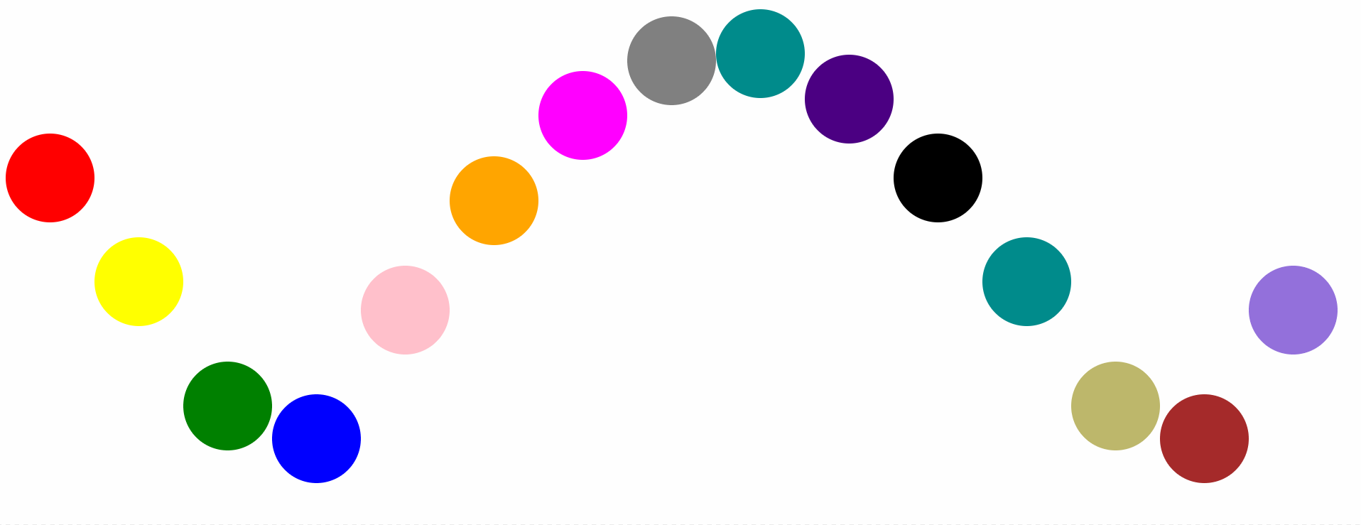
酷炫球
div {
  float: left;
  width: 100px;
  height: 100px;
  border-radius: 50%;
  animation: bounce 0.5s infinite ease-in alternate;
}

.ball1 {
  background-color: red;
  animation-delay: 0.1s;
}

.ball2 {
  background-color: yellow;
  animation-delay: 0.2s;
}

.ball3 {
  background-color: green;
  animation-delay: 0.3s;
}

.ball4 {
  background-color: blue;
  animation-delay: 0.4s;
}

.ball5 {
  background-color: pink;
  animation-delay: 0.5s;
}

.ball6 {
  background-color: orange;
  animation-delay: 0.6s;
}

.ball7 {
  background-color: fuchsia;
  animation-delay: 0.7s;
}

.ball8 {
  background-color: gray;
  animation-delay: 0.8s;
}

.ball9 {
  background-color: darkcyan;
  animation-delay: 0.9s;
}

.ball10 {
  background-color: indigo;
  animation-delay: 1s;
}

.ball11 {
  background-color: black;
  animation-delay: 1.1s;
}

.ball12 {
  background-color: darkcyan;
  animation-delay: 1.2s;
}

.ball13 {
  background-color: darkkhaki;
  animation-delay: 1.3s;
}

.ball14 {
  background-color: brown;
  animation-delay: 1.4s;
}

.ball15 {
  background-color: mediumpurple;
  animation-delay: 1.5s;
}

@keyframes bounce {
  from {
    margin-top: 0;
  }

  to {
    margin-top: 500px;
  }
}